Streamline the look
Oh, the baby blue splashback looks amazing… 50 years ago!
Image of existing Kitchen before renovation:
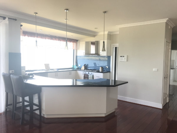
OK, to be fair, the colour itself is not an issue, it’s when the wrong combination of other colours and materials and untidy edges in the space making the original kitchen a let down.
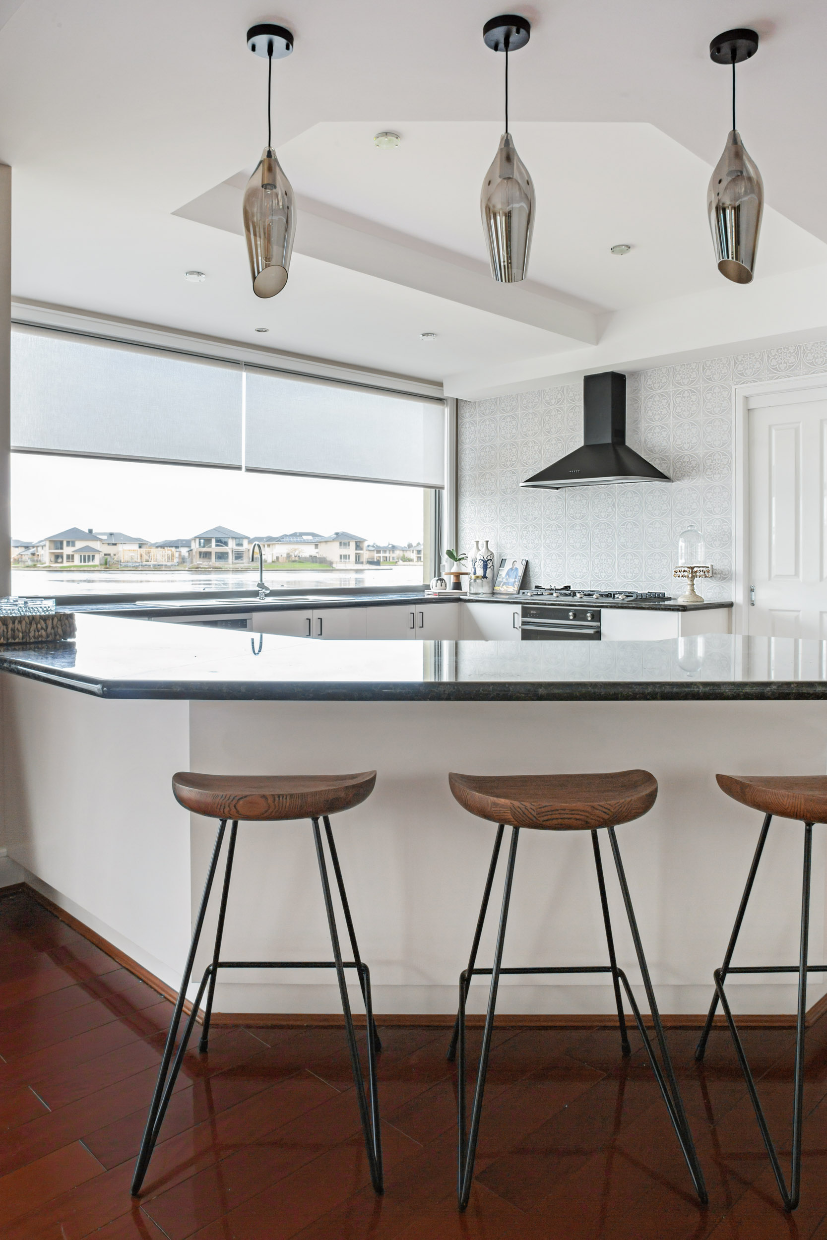
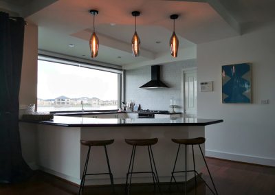
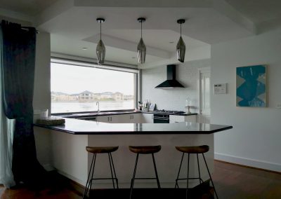
We retained the black granite benchtop and had the builder repaired the damage due to the house’s movement over time; we also got rid of the overhead cupboards and extended the existing bulkhead (for rangehood ducting) to change the messy corners look into something that looks cleaner.
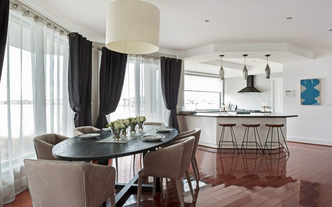
The bulkhead extension above the breakfast counter island also forms a perimeter for the kitchen to not only gives a definition of the kitchen space but also acts as a smoke trap so the smoke occurred during cooking is less likely to be travelling upstairs – the rangehood is never 100% efficient especially when you are doing Chinese cooking.
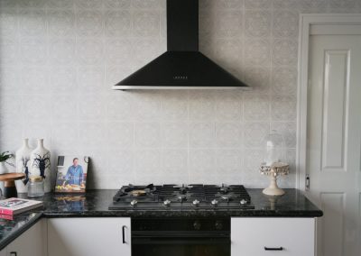
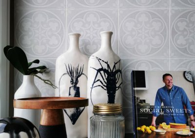
We also used the lovely pale colour patterned tile on the whole wall as a subtle backdrop for the black canopy rangehood, as well as the tulip-shaped Bella smoked glass pendants.
We wanted this colour scheme to compliment the magnificent lake view from within the space but still have that strong accent of character, which comes through by the black/dark appliances, lighting and accessories.
To be continued…
See part 1 of the post – Looking in, looking out. Sanctuary Lakes Residence. (Part 1)
Check out Project Page – Sanctuary Lakes Residence

Recent Comments