I am so touched by the details! We will engage you again for our future homes too – 30/6/19
Joyful moment
Phew! it took one whole year to see this project completed! What a journey! Let’s have a look at our journey starting from the beginning…


Sanctuary Lakes Point Cook
It’s not the first time we visited Sanctuary Lakes. We had done a couple of projects here in the past including small scale interior/extension work and home staging project, however every time we drive into the area, I always slow down the pace and take a breath in to relax, and takes a moment to enjoy such relaxing and beautiful environment.
This is a man-made lake created specifically for the Sanctuary Lakes community. I have to say they do a really good job in allowing the animals and the plants to grow and live here. It is probably the best piece of land in Melbourne’s west (Yes, I want to move here for retirement… lol.)
Why hire an interior designer?
The house is 10 years old, it was barely lived in by the original owner, and you can see why…


Although the house was custom-built, there are many issues needed to be addressed.
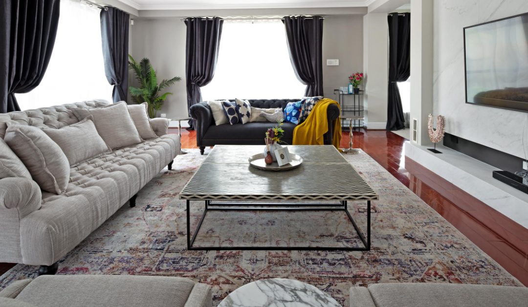
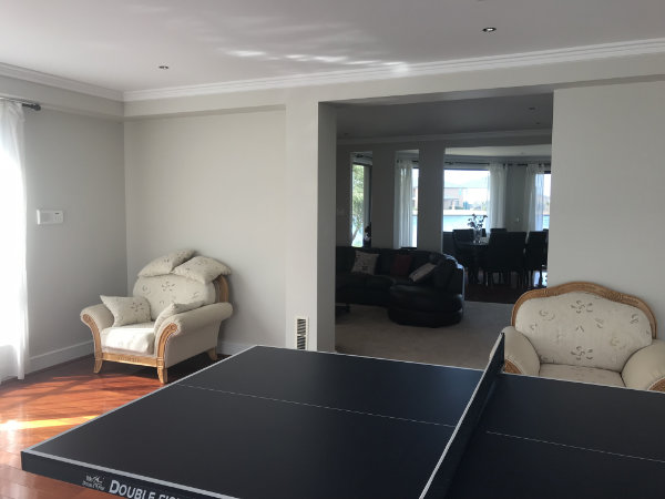
Tiny lounge room for a 5 bedroom house
The original ground floor living area has a really big room that looks like it’s supposed to be the main lounge room, however, it is simply unusable, having one opening connecting to the main entrance hall, and the other opening cutting right in the middle of the room. There are full height windows EVERYWHERE throughout the house, and this lounge room is no exception. There is no focus point to allow for TV wall which is essential in most people’s living area. The last owner decided to use the big space to keep their pin pong table and take the TV to a small corner in adjacent space – it may be cosy in winter days for the family to cuddle together, but there is no room for any guests.
Outdated colour scheme (or lack of colour scheme)
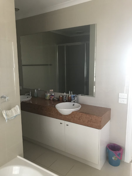
Pink carpet. Baby blue splashback. Brown earthy vanity in bathroom, black vanity in another. Baby blue on external doors and columns with grey window trims everywhere else.
I think we said enough…
Hotchpotch styling decision
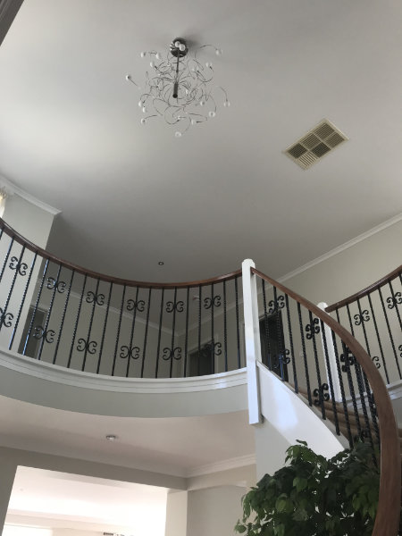
Every room has its own style of window furnishing and furniture – although I do like to mix and match, but this was mixing with no matching! The feature pendant at the stairwell is also too small for its location and its tyle look really out of place, it’s obvious that there was no thought put into the selection even by the standard 10 years ago.
The good news is that all the current furniture are being taken away so we can start fresh!
Design Development
We started with the floor plan to come up with a better layout, that can really utilise the usage of the space, as well as placing the furniture to suggest how the different spaces can be used. Below is one of the final version done in Sketchup –
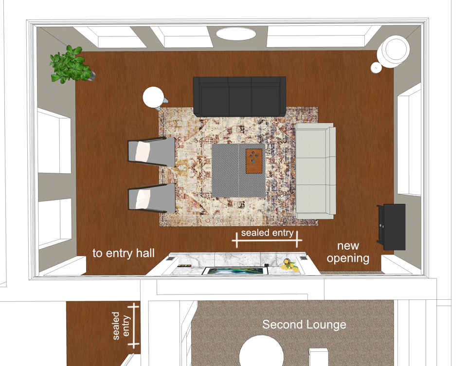
Layout changes
The major change of the ground floor layout is to improve the circulation of space across the entry hall, main lounge room, second lounge room, and dining room.
We sealed off the direct access into the second lounge room from the main entrance, so instead of seeing a secondary lounge area in the first sight, any visitors would be led into the main lounge area when they enter the house.
Interior colours
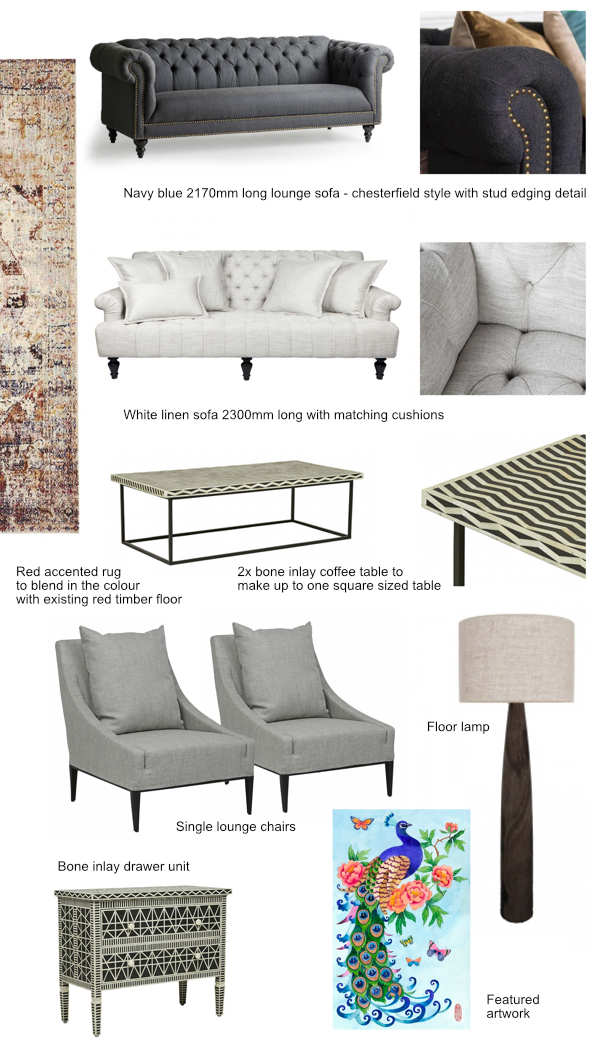
As we are not making drastic changes to most of the spaces in this house, we curated our design by making a combination of furniture, artwork and decorative items to tie in the colour scheme, and working with existing red timber flooring.
As the existing timber floor has a really prominent red, which is quite overwhelming – we chose to use an overscale multi-colour rug that has the red accent, the gradient colour blends into the simple colour of dark navy/creme/black&white scheme of the furniture.
We also replaced the existing pink carpet with luxurious thick cut pile beige colour carpet and premium underlay. Every time I step into the carpeted area I feel like lying down on the carpet to do a test drive for the client on how comfy it is… (this totally didn’t happen ok?)
Bathroom & En-suite Revamp

The original ensuite had no door, the shower and toilet were pushed down to the end so they had a huge open space, and in this huge space, they had a bathtub and a double vanity, with plain tiled walls and floow. It was spacious but it felt underutilised. There is a big full-height window to the lake view from this room but you won’t be able to enjoy the view while taking the bath as they were too far away.
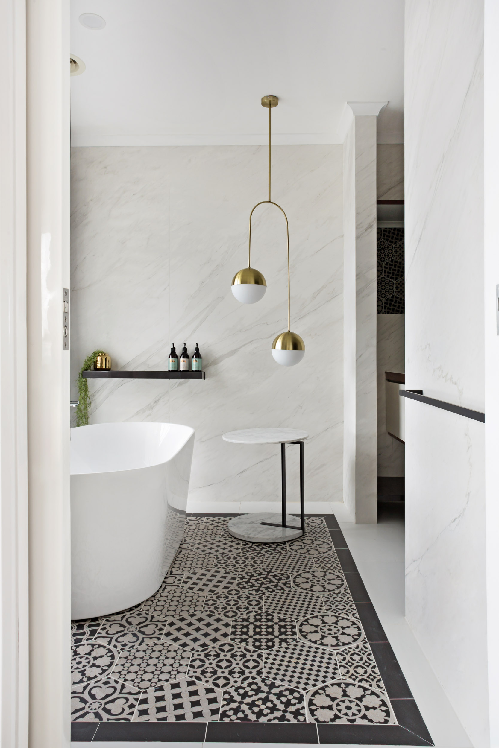
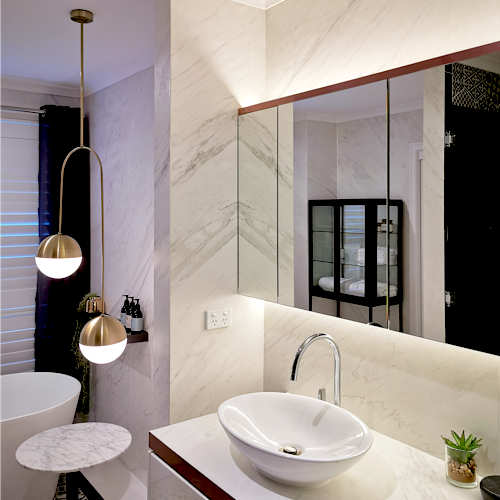
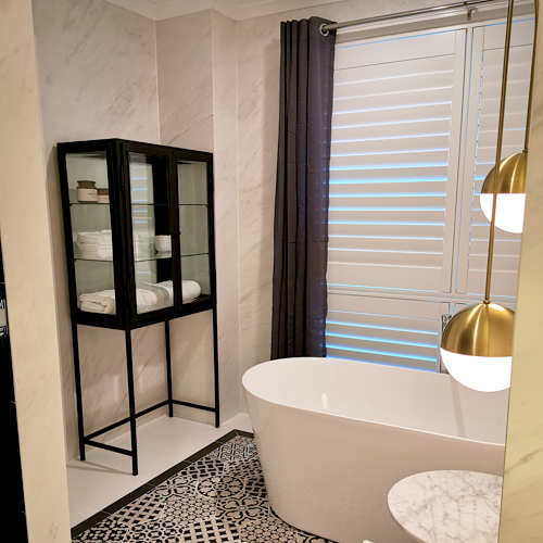
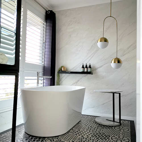
We gave the ensuite a new layout, placed a freestanding bath next to the window and installed french shutter to allow privacy and still maintain the beautiful lake view. The room is filled with marble look porcelain panel all around the walls, with feature inserts that framed the bath area, as well as the shower/toilet zone.
The built-in mirror cabinet expands the internal space visually, and the backlit LED is casting soft warm lighting into the intimate space which is separated by a smoked grey glazed partition.
The brass duo pendant is the focal point that brings the luxurious sparkle into this space.

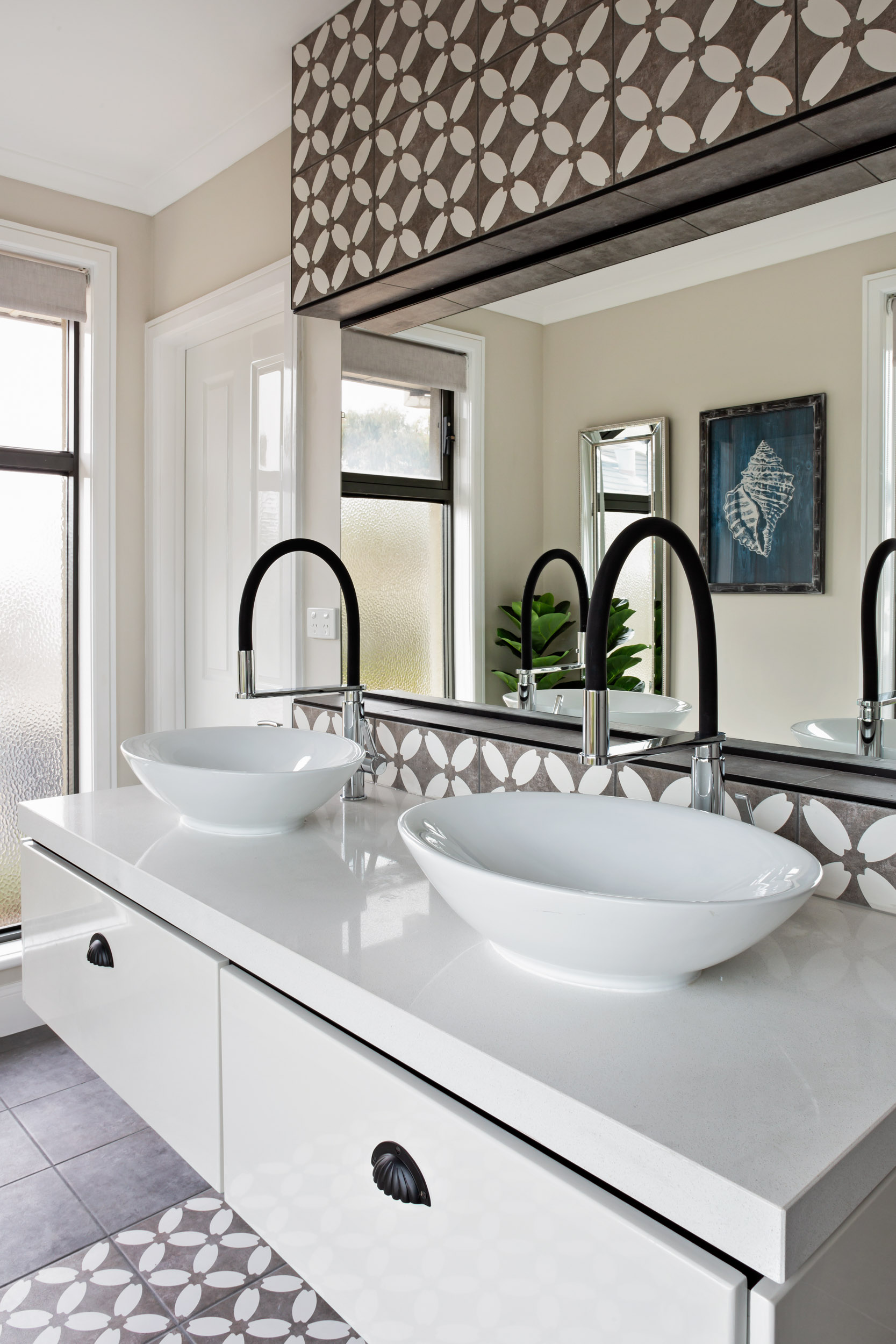
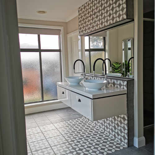
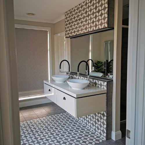
The shared bathroom also received a makeover – we demolished the aged looking tiles and vanity, and put in a full-height feature hob that extends to the floor. Instead of having fully tiled walls, we installed plasterboard and gives an opportunity to hang artwork and mirror on the wall. This room also had large window opening everywhere so having simple plasterboard wall gives it a bit of breather space, and having loose artwork created an atmosphere that feels more lived-in and relaxed.

To be continued…
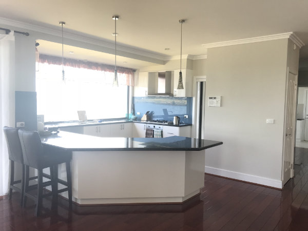
See part 1 of the post – Kitchen makeover. Sanctuary Lakes Residence. (Part 2)
See this project’s portfolio page at Sanctuary Lakes Residence.
Recent Comments